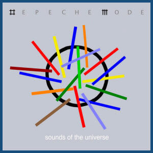
 There is a poster for this new Depeche Mode album called "Sounds of the Universe" down the street from me at the corner store, and I just think this is the most perfect album graphic I've ever seen. It's so simple and says everything it needs to with just a circle and some lines.
Love it.
I feel like I don't need to explain. But let me know if I actually do.

2 comments:
Alright, I am not disagreeing with you, but I am curious to know what this design says to you.
It's the globe, with different colors of sounds coming from all corners of the earth. None are more important that the other, just different. Totally simple. Totally awesome, especially for someone like me who loves all sorts of music from all different places. "Sounds of the Universe" might not be the *best* label for my definition, since I see this graphic as the earth, but it's close enough. You never know what kind of music they're making up on Pluto :)
Post a Comment